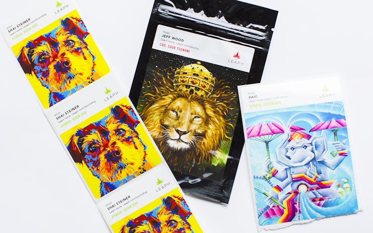
The world of cannabis packaging is exploding with creative new concepts, and thanks to industry growth, designs are rapidly shifting toward classier and ever more consumer-friendly while striving to truly reflect the particular strain or product within. This is particularly important in states like Washington, where consumers are unable to scrutinize, smell, or otherwise interact with products prior to purchase. At the same time, in the face of rapid evolution, brands still have to consider how to respect classic cannabis culture while moving towards updating cannabis’s image.
How can a single company stand out from the crowd by producing fresh, eye-catching packaging without alienating the artistic vibes of yesteryear? To answer that very question, we sat down with Burgandy Viscosi—art curator for Washington brand Leaph—to hear about the company’s unique vision for bespoke packaging designs that capture the nuances of their product names and effects.
Leafly: What is the selection and submission process like for choosing artists to feature on Leaph’s packaging? How many submissions do you usually get?
Viscosi: The selection process has varied. We have made calls out on social media and had at least 50 submissions since we started. I also reached out to the Visionary Arts community, a collective of artists I’ve been working with for the last 10 years, as well as looking for specific animals within art and contacting an artist that way.
How has the selection process changed over time?
Now we are looking into creating contests for artist submissions. This will be our new process going forward because we aren’t always positive the strain will stick and become a permanent part of our collection. This gives a new artist an opportunity to win a contract with us.
Are there any motifs that are common across all of the packaging designs?
Our one motif is an animal theme. As we progress forward, we become more specific about the art relating to strain characteristics, or even its relation to the strain’s name. I feel, in time, this will be the refining of the overall feel of the art connected to the cannabis specifically.
How do you think modern packaging designs reflect cannabis culture of the past? Is that something you think about when choosing artwork for Leaph?
Absolutely. Our CEO Yossarian Kelley was Alton Kelley’s son. Alton Kelley did many of the Grateful Dead album covers. The art of that generation heavily influenced many of the artists that we have on our packaging. Cannabis has been a huge part of the American Arts movement, but maybe just behind the scenes—until now.
What has been your favorite strain image thus far? What was the strain and who made the artwork?
I try hard not to have favorites … I love all of the art equally. But, of course, I have undeniable appreciation of how it translates onto the package.
Shop highly rated dispensaries near you
Showing you dispensaries nearHowever, I specifically created the tiger for Blue Fire, and even worked the logo into the image. Unfortunately, that is one of the strains that we had to phase out. So I must say I miss that particular piece being part of the collection.
What kind of art catches your eye from the get-go?
Personally, I love work that is bright and bold and engages the imagination. The rise of Visionary tends to be my go-to.
Art curator for a cannabis company is an awesome job. How did you get started as a bona fide art curator in the cannabis space?
Art curation seems to be a natural fit for someone who understands the creative process on a personal level, then takes it off the canvas into larger formats, like orchestrating a collective of art.
Cannabis has always been such a Muse of the art and its artist, so this is such a natural fit. I’m extremely grateful to be part of this alignment.


